They say change is as good as a holiday, and although I’d mostly disagree because I’m ALL about vacations I do feel that when it comes to changing up the colour around your home it can absolutely make you feel just as refreshed as taking a holiday.
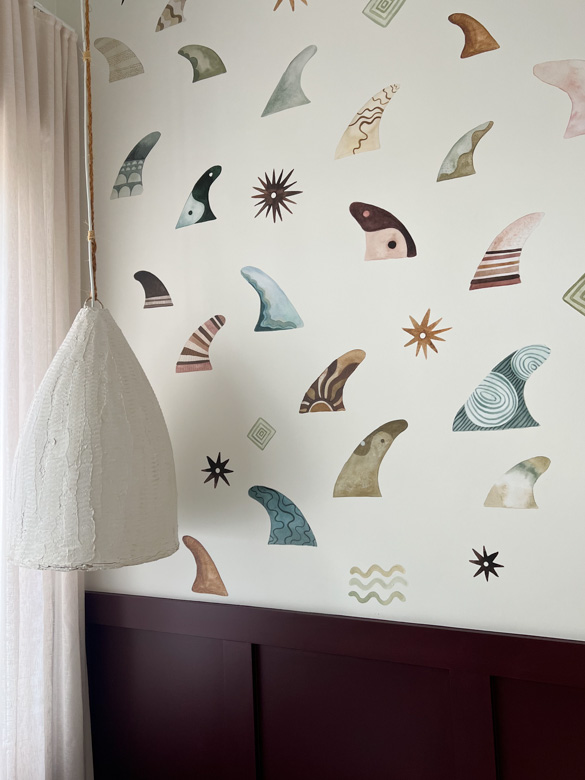
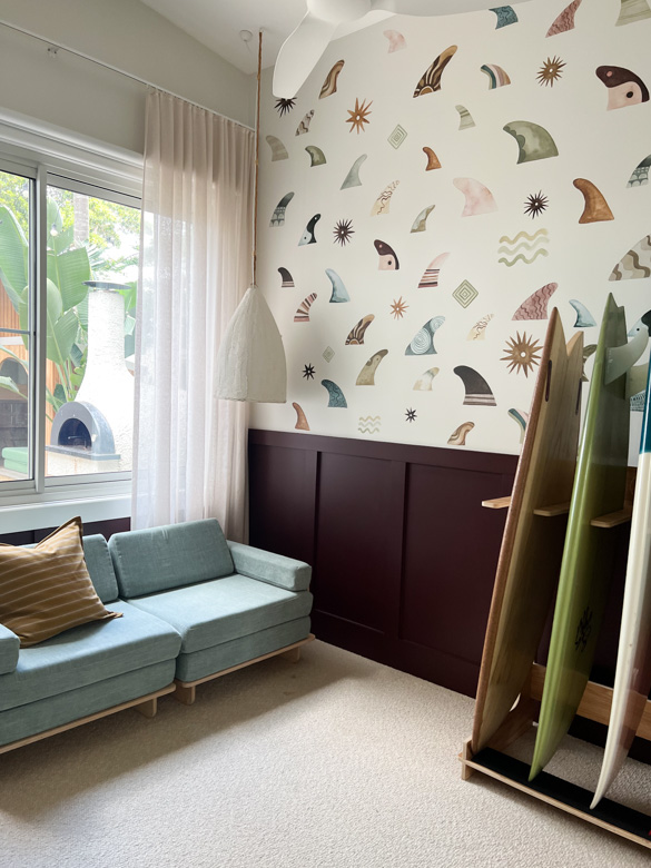
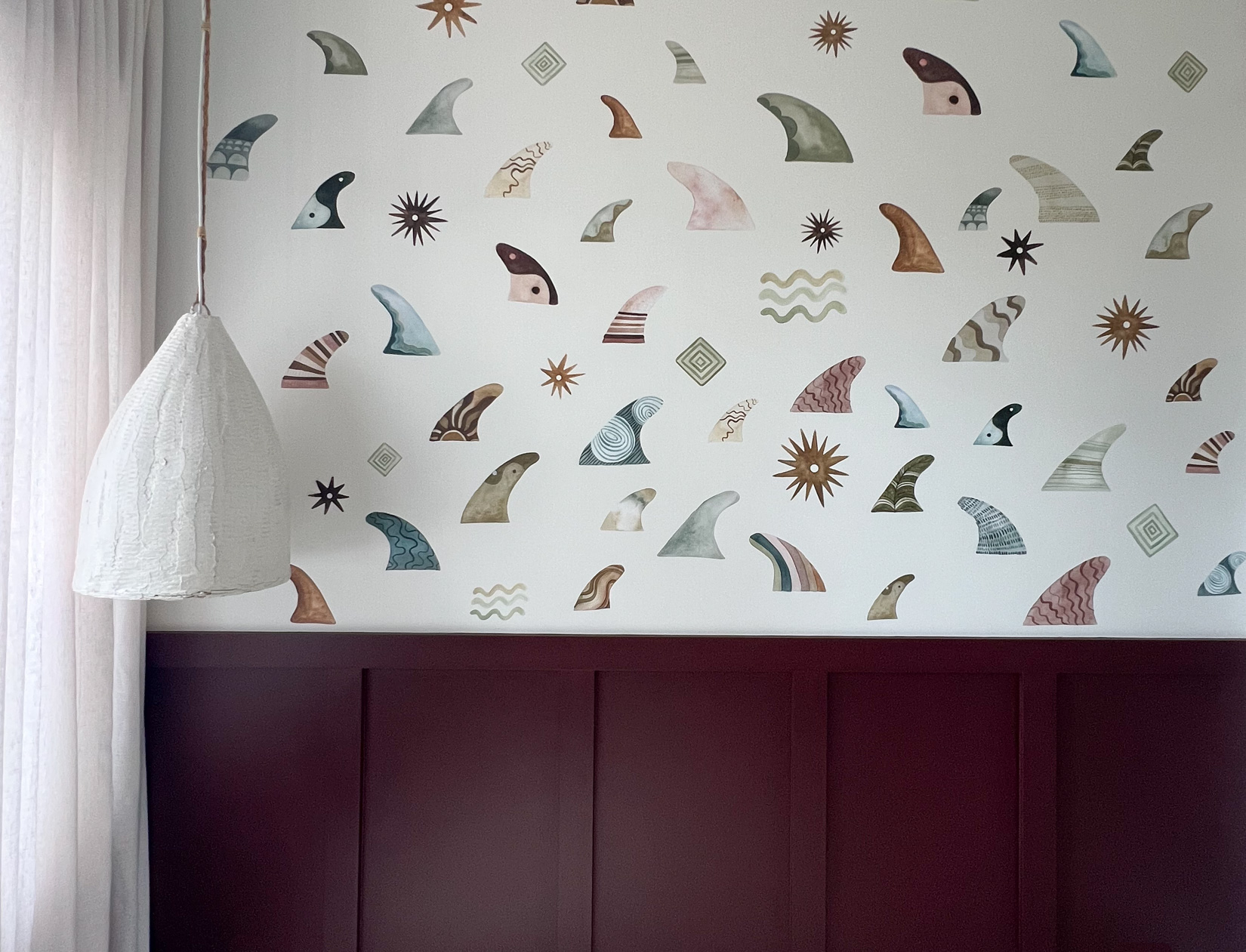
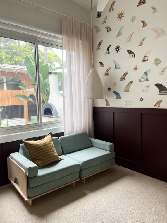
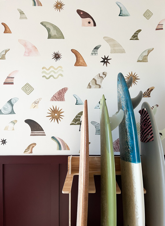
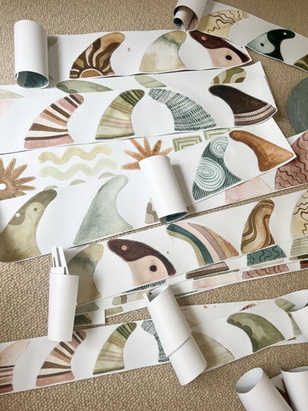
The kids have been using this bedroom as a toy room for almost three years now and although I love it, the time had come to cull some toys in the form of donations to friends and some local charities. With that I thought I’d take the opportunity to change up the look and showcase our brand new wall sticker collaboration with KK Homewares and Farrah’s Stone.
This collaboration is inspired by the old school charm of vintage surfboards and fins, with the colour palette inspired by coastal elements. With this in mind, I wanted a bold colour for the wall panelling below that played on the vintage theme. I instantly thought of the Taubmans 2022-2024 Colour Report ‘Chromatic Joy’ – a celebration of bright, bold colours.
I chose 5 colours to sample – all very different from one another as I wanted to keep an open mind as to which direction I might take with the colour. The beauty of the fin wall stickers is that there are so many colour themes it could suit, and you can draw on any one – or more – of these colours to create your own look.
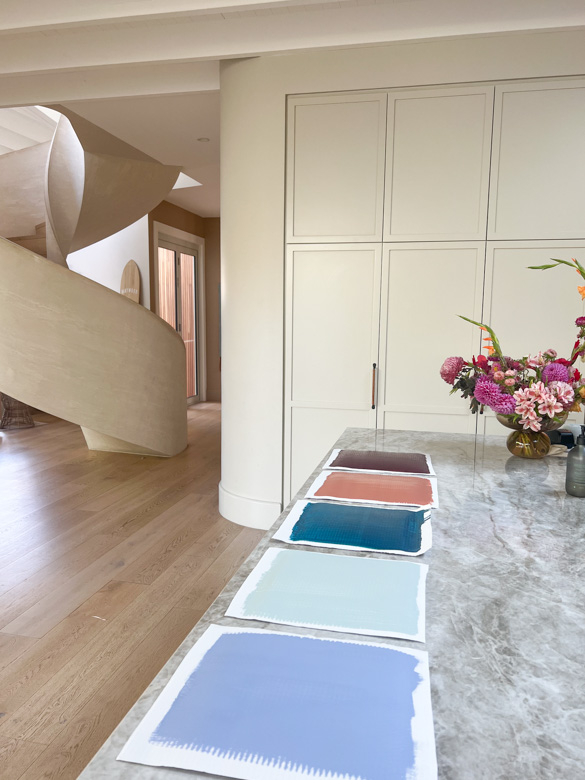
I settled on Taubmans ‘Papatūānuku’ which is quite a bold choice for my coastal home, but I felt inspired to do something different. When the first coat of paint went on, I have to admit I questioned my decision but I had to practise what I preach and trust the process. As soon as the second coat went on, the colour was much deeper and it started to make sense.
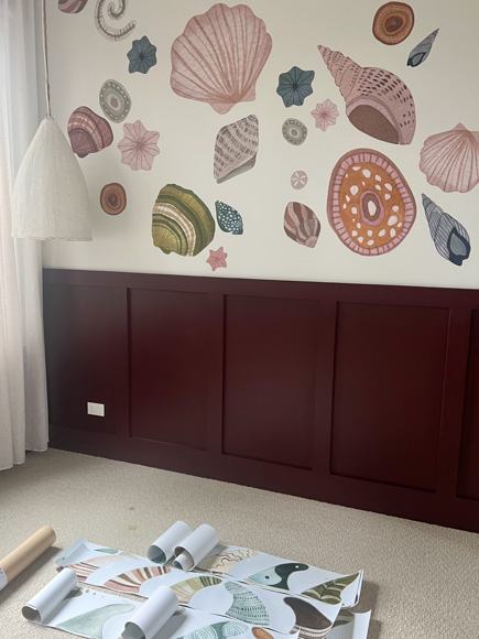
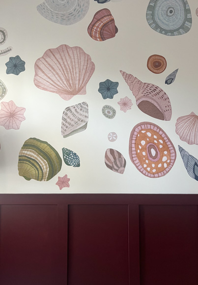
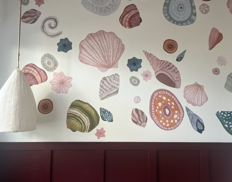
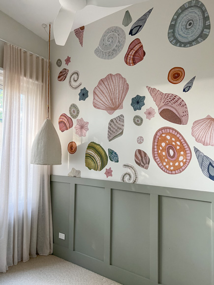
Turns out the colour worked so well with the existing wall stickers (Seashell Wall Stickers collaboration with Farrah’s Stone) and I must admit that I was very reluctant to change them for that reason! A credit to the product, after three years the seashell stickers came off so easily, leaving no marks or residue on the wall, and we re-stuck them on some baking paper to use elsewhere. As soon as the fin stickers began going up I was in LOVE. I’m so happy with how ‘Papatūānuku’ works with the fin colours, and feel it really plays on the browns and maroons. It also inspired me to create a room that plays on the blues of the fins, but that’s a job for another day!